Picture this: your brand, corseted in copperplate script, stamped in wax, and advertised by a town crier with an impeccable top hat. Now flick the dial forward: your mark breathing in holographic ink, animating only when the wearer laughs, optimized for lunar billboards and contact lenses. Brand identities aren’t just shapes; they’re time machines that hint at values, tools, and dreams.
In this playful expedition, we’ll send your logo skipping through centuries to see which versions still sing—and which should stay politely in the museum. We’ll sketch, experiment, and test, and we’ll translate those insights into a present-day identity that feels inevitable. Dreamina is our studio companion for the ride, and yes, the journey starts with an AI photo generator that can conjure historical textures—vellum, woodcut grain, daguerreotype sheen—and future-facing atmospherics your camera can’t capture at noon.
Eras as mirrors: what each century reveals about your brand
Every era has its typography, material culture, and social tempo. Borrowing their lenses helps you refine yours.
-
1800s lens — Proof of craft: Engraved details, serif authority, letterpress ink spread. A brand must look hand-built and reliable.
Ask: Does your mark survive as an emboss on leather or a seal in wax?
-
1900s–1930s lens — Industrial confidence: Streamlined geometry, monoline strokes, mechanical symmetry.
Ask: Can your logo be held as a badge on metal or enamel signage?
-
1960s–1980s lens — Pop and protest: Bold color blocks, playful counterforms, experimental grids.
Ask: can the mark play on posters and TV idents without losing its soul?
-
Nowish lens— Adaptable systems: Dark-mode fluency, responsive markings, and variable typography.
Ask: can your identity breathe across app icons, packaging, and motion?
-
2200s lens — Ambient identity: Light-as-ink, reactive textures, sound-mark pairings.
Ask: What does your logo do when “surface” is optional?
Testing these lenses is like sending your logo to boot camp and drama school on the same day.
The 1800s brand audit: guild-worthy gravitas without the dust
If your product is craft-led—coffee roastery, denim maker, letterpress studio—try a nineteenth-century pass to uncover ornament that still feels fresh. You might rescue:
-
A monogram that compresses elegantly into a coin.
-
An emblem that reads when reduced to a signet ring.
-
A framing device (cartouche, border, ribbon) that organizes information like a Victorian ad.
But resist the temptation to over-curlicue. The trick is to quote the century, not cosplay it.
The 2200s brand run: readable at light speed
Now run your mark through a speculative future. Strip unnecessary decoration. Explore forms that morph subtly in motion or respond to context (night vs. day, quiet vs. loud spaces). Consider:
-
A core glyph that remains recognizable when rendered in light, not pigment.
-
Grid logic that supports micro-animations at tiny sizes.
-
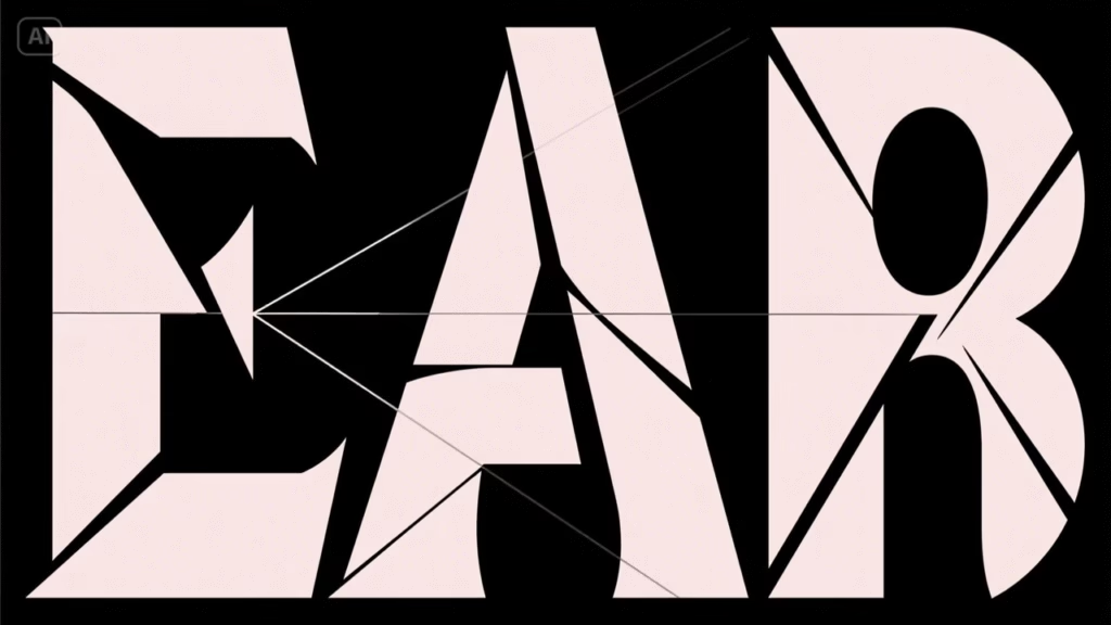
A typographic axis (width or slant) that can shift to communicating mood, such as acronyms like “EAR” for “Evermore Audio Relics.”
This exercise keeps your modern mark light on its feet while preserving a recognizable silhouette.
Your traveling brand kit: packing list for century-hopping
Assemble a little kit before we enter the portal:
-
A one-line brand promise that works in any era (“Tools for brave beginners,” “Good rituals for busy humans”).
-
Two type families: one serif with historical grace, one sans with future-friendly geometry.
-
A minimal symbol whose proportions echo your initials or hero object (feather, key, spark).
With those, you can decorate for time periods without losing your address.
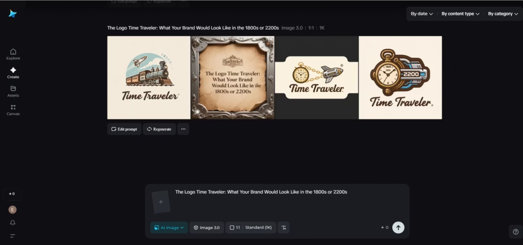
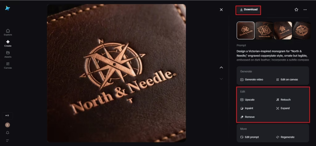
The century-hopping logo lab (with Dreamina)
Our trip gets faster with the right collaborators. Use a quick session with Dreamina’s AI logo generator to spit out period-informed variations (engraved, enamel, ultramodern) against your constants. Next, use interface mockups, labels, or prototype posters to assess the mark in action. Here’s how:
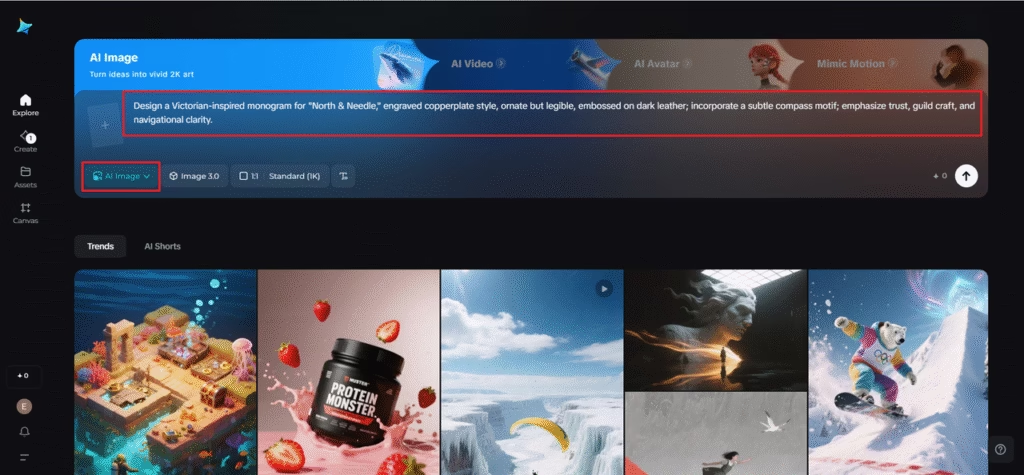
Step 1: Write a text prompt
Navigate to Dreamina and draft a detailed prompt that includes the era, materials, typography, mood, and brand essence.
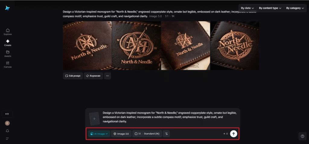
Example: Design a Victorian-inspired monogram for “North & Needle,” engraved copperplate style, ornate but legible, embossed on dark leather; incorporate a subtle compass motif; emphasize trust, guild craft, and navigational clarity.
Step 2: Adjust parameters and generate
Choose a model suited to typographic and emblem design, set an aspect ratio that suits a mark (square or 4:5 for lockups), select size, then pick a resolution—1k for quick sprints, 2k when you’re ready to inspect line joins and counters. Click Dreamina’s icon to generate. Review variants for silhouette, internal negative space, and how the mark reads at a tiny favicon scale.
Step 3: Customize and download
Refine the strongest options: use inpaint to sharpen terminals or swap a motif, expand to audition alternate borders or lockups, remove extraneous filigree that clutters small sizes, and retouch contrast so emboss and screen both look intentional. When the logo expresses the era and your essence, click the Download icon to save master files you can test in print and motion.
Designing with companions: when tools become co-authors
Finally, if you’re exploring treatments—etching, fresco, glitch, stitch—a free AI art generator helps audition surface styles before you invest in production. The point isn’t to outsource taste; it’s to widen your audition pipeline, so your taste has better candidates.
Creating a timeline for your logo that includes key ideas and little vignettes
A logo proves itself where it lives. Build three tiny scenes to trial your mark:
-
The letterpress receipt, 1887: Print a faux invoice with your emblem stamped at the top. Does the texture cradle the mark or swallow it?
-
The broadcast bug, 1979: Drop the mark as a corner bug on a grainy TV shot. Does it hum without shouting?
-
The wearable glow, 2194: Mock a light-reactive badge on fabric. Does the shape read when rendered as pure luminance?
You’ll discover scale limits, stroke weights, and where your symbol sings or stumbles.
Typography as time travel: words wearing eras
Type is the accent your logo speaks with. Pair your mark with a serif that references the past and a sans for the near future; let the two create tension. Keep copy succinct. The same line—”North & Needle”—can whisper in old-world small caps or blink in a modern variable sans. Consistency across the skeleton (proportions, rhythm) allows wild costume changes without identity whiplash.
Color that respects both candlelight and quantum billboards
Color is era-sensitive. For your historical pass, lean into ink-friendly darks, muted dyes, and metallic accents that emboss well. For the speculative pass, explore emissive palettes and dark-mode harmony. Build a core palette whose values map cleanly across both rich mid-tones, considered contrast, and one confident accent. This keeps your brand steady as the lighting changes from gas to photon.
The souvenir you keep: a present-day logo with time-tested bones
After the tour, refine a new version that holds the best discoveries: Victorian composition sense, mid-century clarity, future-proof minimalism. Your final mark should be embossed on paper, animate at 16px, and glow on fabric without redrawing. That’s not a compromise; that’s a harmony.
Read More: Future-Proofing Your Brand: How to Optimize for Voice Search
Closing the loop: your time-spanning identity starts today
You’ve walked your logo through woodcut alleys and orbiting billboards and brought back a mark with better bones. Dreamina made the journey quick, from crisp prompts to polished exports, and your modern brand now carries the quiet confidence of something that’s already survived a century—and is ready for another. Keep the exercises handy; whenever your identity feels stale, take another temporal field trip and search for fresh clues. Download your favorites, archive the near-misses (they often return with new jobs), and keep your brand curious. The portal’s always open, and your next era is one prompt away.