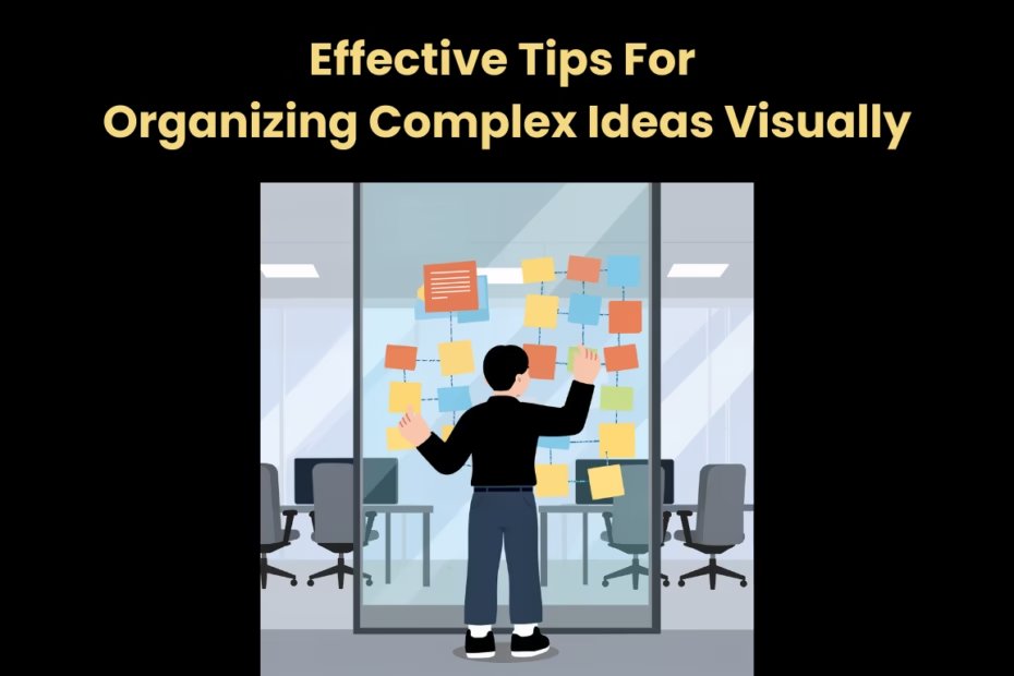
Complex ideas feel hard when they hide structure. A good visual pulls that structure out so you can see what matters, what connects, and what is still fuzzy. The goal is not to make something pretty, but to make thinking easier.
Start with a Single Visual Question
Before you draw anything, write the one question your visual needs to answer. When you map the answer with Lucid.co or a similar software solution, keep the question visible so every box and arrow earns its place. If an element does not help answer the question, cut it or move it to a new page. It is a fast way to spot drift.
A simple question can make the scope clear. Instead of “Explain the whole project,” try “What blocks the release?” or “Where does this process fail?” You can always add a second diagram later, but the first diagram should stay focused.
Pick a Visual Format That Matches the Thinking
Not every idea wants the same shape. Think of format as a lens. A timeline works for change through time, a flowchart works for steps, and a concept map works for meaning and relationships. If you choose the wrong format, you end up forcing information into a layout that fights you.
A Baylor University Canvas announcement described Lucid as a go-to platform for interactive diagrams like flowcharts and mind maps that help people visualize complex ideas and collaborate. That mix of formats is a useful reminder: the best visual is the one that matches the kind of thinking you are doing, not the one you used last time.
Use Concept Maps to Show Meaning, Not Just Steps
Flowcharts are great for “then what,” but concept maps are better for “what does this mean.” They work well in early research. They help when you are dealing with abstract topics, messy research, or competing definitions. Start with 1 central idea, then add related ideas, then label the connections with short phrases.
An NYU School of Professional Studies post argues that concept mapping is not only about displaying knowledge, but about actively building a framework of understanding. That mindset shifts your diagram from a poster into a working model that can change as you learn.
Quick labels that add clarity
Use verbs for links when you can. “Causes,” “requires,” “depends on,” and “conflicts with” turn lines into explanations. If a link feels hard to label, that is often a signal that the relationship is not clear yet.
Break Problems into Visual Parts
When a problem feels overwhelming, it helps to externalize it. Once pieces are visible, patterns show up. Put the pieces on the page, then arrange them until the relationships make sense. This is very useful for troubleshooting, planning, or studying something new.
A teaching guide from Ambitions ABA notes that visual representations help people organize information, understand relationships, and clarify what a problem is asking. In practice, that means your diagram should make the question easier to read, not just the answer easier to store.
Here are 5 visual moves that work for many complex problems:
- Split causes, symptoms, and constraints into separate groups.
- Draw a boundary around what you control versus what you cannot.
- Mark unknowns with a clear tag like “TBD” or “Need data.”
- Add examples next to abstract terms to keep them grounded.
- Show feedback loops where actions change the next input.
Build a Clear Hierarchy with Levels and Labels
Complexity often comes from mixing levels. Hierarchy keeps details from taking over. Strategy, tasks, and details end up side by side, so nothing feels stable. A clean hierarchy gives readers a ladder: big ideas at the top, supporting ideas below, and specifics at the edges.
One simple rule is 1 idea per node. If a node needs “and,” it probably wants to be split. Use labels that a new reader can understand in 10 seconds, not labels that only make sense to you in the moment.
Make levels visible
Use headings inside the diagram, or add a small legend that explains levels. For example, you might label groups as “Goals,” “Inputs,” “Decisions,” and “Outputs.” Once levels are clear, you can spot gaps quickly, like goals with no measurable outputs.
Make Relationships Obvious with Connectors and Grouping
A diagram is a language of relationships. Clarity rises when rules stay steady. If connections are vague, the reader has to guess, and guessing is where misunderstandings start. Use arrows for direction, lines for association, and groups for “belongs together.”
Keep connector logic consistent. If arrows always mean “leads to,” do not reuse arrows to mean “is similar to.” When you need multiple relationship types, add short labels or a legend, and keep the number of relationship types small, ideally 3 or fewer.
Reduce Noise with Simple Rules of Layout
A messy layout can hide a good idea. Small layout fixes can change comprehension. The fix is rarely more detailed; it is better spacing, alignment, and repetition. Layout rules help when diagrams get edited by several people.
These layout rules help when a visual starts to feel crowded:
- Align nodes to a grid so the eye can scan faster.
- Keep generous whitespace between groups.
- Limit each node to 1 short sentence.
- Use consistent casing in labels, like sentence case.
- Reserve bold or color for 1 purpose only.
If you are not sure what to remove, remove the decoration first. Drop unnecessary icons, background shapes, and long sentences. Then check whether each remaining element earns its spot.
Read More: Medical Transcription Software Comparison: 9 AI-Powered Solutions for 2026
Stress-Test the Visual with a Quick Read-Through
A diagram should survive a fast read. Testing saves time later. Start at the top left or the central node and follow the most natural path. If you cannot explain the diagram out loud in 60 seconds, it is probably doing too much.
Next, test it with someone who was not in the work. Invite them to tell you what they think it says, not what they like about it. The gap between their story and your intent is the best clue for what to fix.
Complex ideas do not become simple, but they can become visible. When your visuals stay focused, structured, and consistent, you spend less time holding everything in your head. That frees you to ask better questions and make better decisions.